Expanding The Product Range
Picture’s worth a thousand words
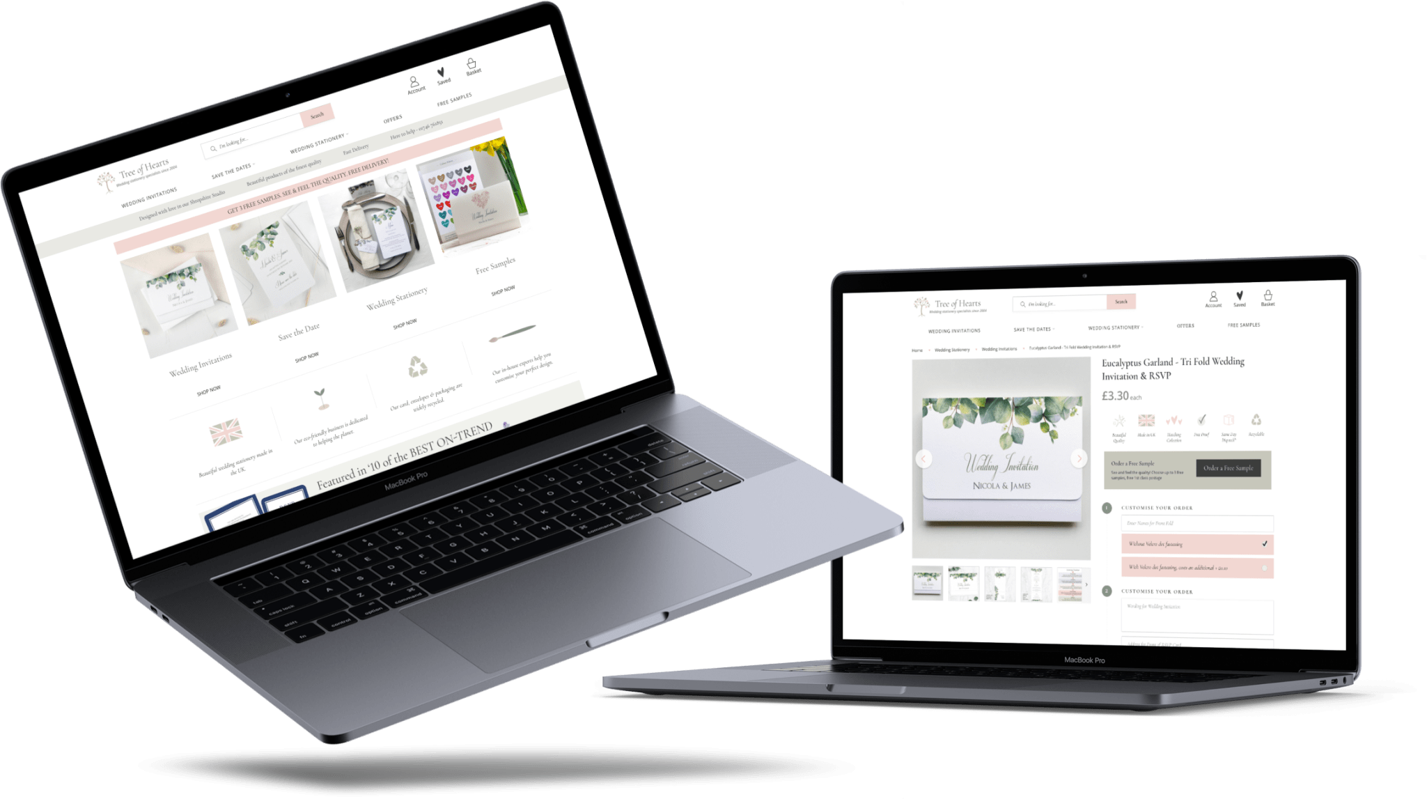
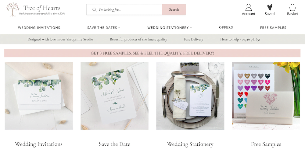
With there being so many variations and varieties of wedding stationery, we felt it best to ‘show’, rather than tell. The most obvious example for this is the home page, where there is content (for SEO and marketing purposes), but it’s discreet and doesn’t get in the way of all the colourful imagery used. The clean design to help this stand out and really help emphasise the variety that is available.
Highlighting the benefits
With many eCommerce sites, highlighting the benefits may seem like a small thing, but can make a huge difference in terms of sales. We accomplished this by applying subtle, yet noticeable banners on every page of the website. These include elements such as offering fast delivery, here to help 24/7 and demonstrating the quality, with the message; designed with love in our Shropshire studio, beautiful products of the finest quality.
Offering try before you buy
We learned early on that for products such as wedding invitations, customers prefer to “try before they buy”. This meant they’d prefer to see the actual, finished product, before committing to an order. The solution to this was to highlight the benefit, prominently on every page.
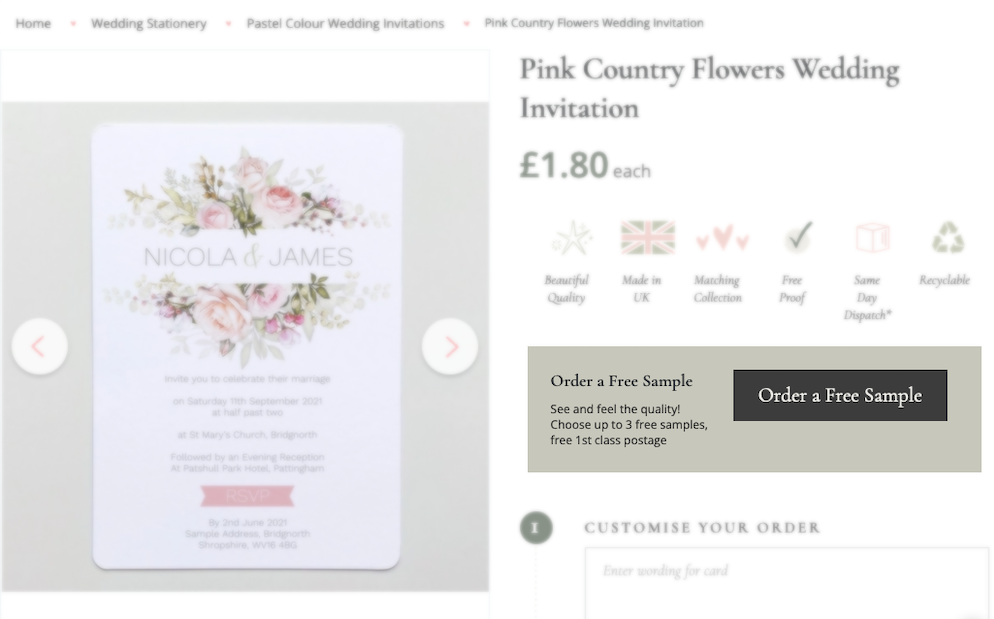
This would then link to a category page, where all the free samples were listed. But that wasn’t everything, we also added a banner with CTA to all applicable products, highlighting that free samples are available for that design.
Highlighting most important elements of the products
So we decided to split the page into two sections: the top half would be split down the middle. On the left side would be the product images, as these are such visual products, we made sure that it scrolled down the page with you, so that it is always in view when scrolling
On the right hand side would be the most important product details such as the name, price, any customisable options, benefits and free sample offers.
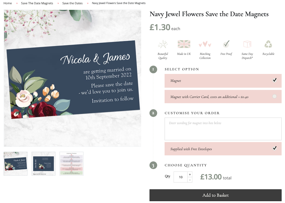
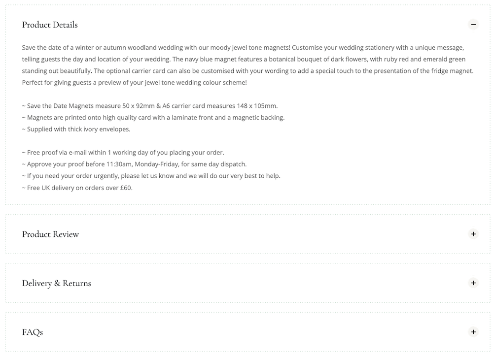
At the bottom, we’d have the specifications of the product, with product descriptions, delivery and returns information and common FAQ’s. This all then comes together so that customers can easily see what they’re getting when they first land on the page and then get more information at the bottom.
Easy, effective checkout process
With the need for making purchases as simple as possible, and over 60% of traffic coming from mobile, it’s imperative to make the checkout process as easy and fluid as possible. We took a few key steps to ensure this. Firstly, a progress bar to show how far through the checkout customers are, making it easy to see how far they are from completing their purchase.
To minimise distractions and keep customers concentrated completing the purchase, we also removed the navigation bar from the top. But that wasn’t all, in the space instead we added some trust symbols via the means of showing accepted cards and the payment provider.
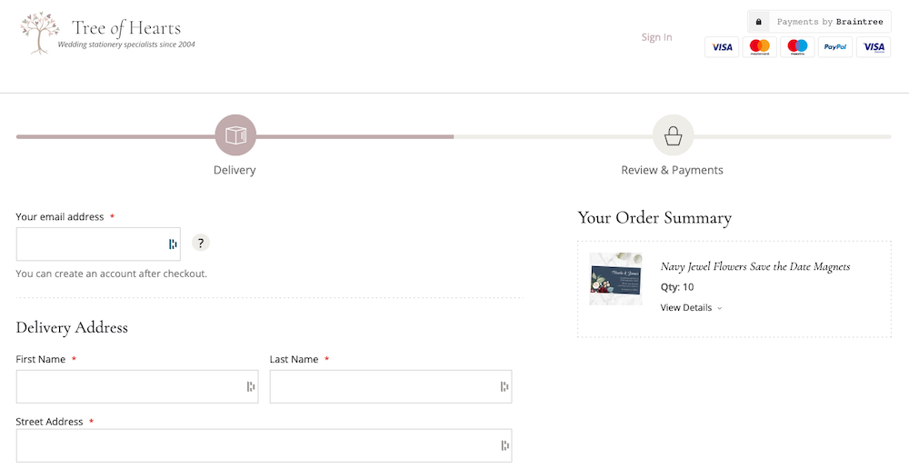
We then boiled the checkout to only the essential, name, address and contact details. Once these were filled in, you’d be taken to the order review section, before being taken off to enter the payment details.
A dedicated channel for wedding stationery
What they have is a dedicated channel, where they can offer the full range of wedding stationery.
This builds value for them as it shows they are offering a dedicated channel, that’s separate from their main website, that they can advertise and direct their target traffic to. All built on a robust, customisable system to provide a tailored experience for their target customers.

