window._wpemojiSettings = {"baseUrl":"https:\/\/s.w.org\/images\/core\/emoji\/15.0.3\/72x72\/","ext":".png","svgUrl":"https:\/\/s.w.org\/images\/core\/emoji\/15.0.3\/svg\/","svgExt":".svg","source":{"concatemoji":"https:\/\/www.isev.co.uk\/wp\/wp-includes\/js\/wp-emoji-release.min.js?ver=6.7.1"}};
/*! This file is auto-generated */
!function(i,n){var o,s,e;function c(e){try{var t={supportTests:e,timestamp:(new Date).valueOf()};sessionStorage.setItem(o,JSON.stringify(t))}catch(e){}}function p(e,t,n){e.clearRect(0,0,e.canvas.width,e.canvas.height),e.fillText(t,0,0);var t=new Uint32Array(e.getImageData(0,0,e.canvas.width,e.canvas.height).data),r=(e.clearRect(0,0,e.canvas.width,e.canvas.height),e.fillText(n,0,0),new Uint32Array(e.getImageData(0,0,e.canvas.width,e.canvas.height).data));return t.every(function(e,t){return e===r[t]})}function u(e,t,n){switch(t){case"flag":return n(e,"\ud83c\udff3\ufe0f\u200d\u26a7\ufe0f","\ud83c\udff3\ufe0f\u200b\u26a7\ufe0f")?!1:!n(e,"\ud83c\uddfa\ud83c\uddf3","\ud83c\uddfa\u200b\ud83c\uddf3")&&!n(e,"\ud83c\udff4\udb40\udc67\udb40\udc62\udb40\udc65\udb40\udc6e\udb40\udc67\udb40\udc7f","\ud83c\udff4\u200b\udb40\udc67\u200b\udb40\udc62\u200b\udb40\udc65\u200b\udb40\udc6e\u200b\udb40\udc67\u200b\udb40\udc7f");case"emoji":return!n(e,"\ud83d\udc26\u200d\u2b1b","\ud83d\udc26\u200b\u2b1b")}return!1}function f(e,t,n){var r="undefined"!=typeof WorkerGlobalScope&&self instanceof WorkerGlobalScope?new OffscreenCanvas(300,150):i.createElement("canvas"),a=r.getContext("2d",{willReadFrequently:!0}),o=(a.textBaseline="top",a.font="600 32px Arial",{});return e.forEach(function(e){o[e]=t(a,e,n)}),o}function t(e){var t=i.createElement("script");t.src=e,t.defer=!0,i.head.appendChild(t)}"undefined"!=typeof Promise&&(o="wpEmojiSettingsSupports",s=["flag","emoji"],n.supports={everything:!0,everythingExceptFlag:!0},e=new Promise(function(e){i.addEventListener("DOMContentLoaded",e,{once:!0})}),new Promise(function(t){var n=function(){try{var e=JSON.parse(sessionStorage.getItem(o));if("object"==typeof e&&"number"==typeof e.timestamp&&(new Date).valueOf()<e.timestamp+604800&&"object"==typeof e.supportTests)return e.supportTests}catch(e){}return null}();if(!n){if("undefined"!=typeof Worker&&"undefined"!=typeof OffscreenCanvas&&"undefined"!=typeof URL&&URL.createObjectURL&&"undefined"!=typeof Blob)try{var e="postMessage("+f.toString()+"("+[JSON.stringify(s),u.toString(),p.toString()].join(",")+"));",r=new Blob([e],{type:"text/javascript"}),a=new Worker(URL.createObjectURL(r),{name:"wpTestEmojiSupports"});return void(a.onmessage=function(e){c(n=e.data),a.terminate(),t(n)})}catch(e){}c(n=f(s,u,p))}t(n)}).then(function(e){for(var t in e)n.supports[t]=e[t],n.supports.everything=n.supports.everything&&n.supports[t],"flag"!==t&&(n.supports.everythingExceptFlag=n.supports.everythingExceptFlag&&n.supports[t]);n.supports.everythingExceptFlag=n.supports.everythingExceptFlag&&!n.supports.flag,n.DOMReady=!1,n.readyCallback=function(){n.DOMReady=!0}}).then(function(){return e}).then(function(){var e;n.supports.everything||(n.readyCallback(),(e=n.source||{}).concatemoji?t(e.concatemoji):e.wpemoji&&e.twemoji&&(t(e.twemoji),t(e.wpemoji)))}))}((window,document),window._wpemojiSettings);
var breeze_prefetch = {"local_url":"https:\/\/www.isev.co.uk","ignore_remote_prefetch":"1","ignore_list":["wp-admin","wp-login.php"]};
https://www.isev.co.uk/app/plugins/breeze/assets/js/js-front-end/breeze-prefetch-links.min.js
https://www.isev.co.uk/wp/wp-includes/js/jquery/jquery.min.js
https://www.isev.co.uk/wp/wp-includes/js/jquery/jquery-migrate.min.js
(function(l,e,a,d,i,n,f,o){if(!l[i]){l.GlobalLeadinfoNamespace=l.GlobalLeadinfoNamespace||[];
l.GlobalLeadinfoNamespace.push(i);l[i]=function(){(l[i].q=l[i].q||[]).push(arguments)};l[i].t=l[i].t||n;
l[i].q=l[i].q||[];o=e.createElement(a);f=e.getElementsByTagName(a)[0];o.async=1;o.src=d;f.parentNode.insertBefore(o,f);}
}(window,document,'script','https://cdn.leadinfo.net/ping.js','leadinfo','LI-68E381926E23B'));
- blog
- Marketing
-
Google Analytics See Where Your Traffic Comes From

October 7,2021
Google Analytics See Where Your Traffic Comes From
by Isev Team
If you have arrived from our email, we are going to go into a little more details to what you will see in the Acquisition > Overview menu item in your Google Analytics account.
For everyone else that has joined us, welcome. We have been talking about an easy way to see where your web traffic comes from, using Google analytics, if you aren’t on our mailing list, you can signup bottom of the page to get the latest in web design and marketing tips.
If you login to your Google Analytics, go to the acquisition menu item > overview, you will be able to see various sections showing your website traffic, but before we look at the different elements on the page, we should mention that you can change the date range for the data displayed from the top right of the page, (by default it will be set to the last 30 days).
The Lovely Pie Chart
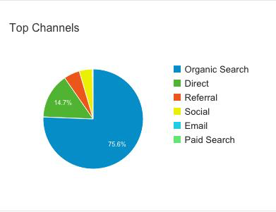
This lovely pie chart shows a quick, visual breakdown of how the traffic sources break down, if you aren’t sure what each of these are, read on, otherwise you can skip to the next ‘The Fancy Graph’.

- Direct – When someone that has come directly to your website through typing in your website address.
- Organic – When someone comes to your website through a search engine from the ‘natural’ results.
- Paid – When someone comes to your website through paid marketing, like Google Adwords.
- Referral – When someone comes to your website through another, this is normally a link to your website.
- Social – When someone visits from a social media site.
- Email – This is traffic from emails, for those of you that run email campaigns.
- Other – Some of you might see an ‘other’ reference, this is uncategorised traffic by Google, that normally comes from third party paid advertising.
In this example, you can see the two biggest sources of traffic are Direct and Organic.
The Fancy Graph

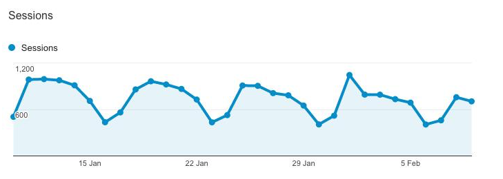
The fancy graph shows how many ‘sessions’ (or visits) to your website, over the set time period, with each point on there showing one days worth of traffic.
The Table

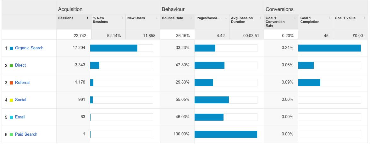
The table at the bottom of the page might look quite complicated, with a lot of information to digest, but if we break down the different sections it should be easier to understand.
The table at the bottom might look quite complicated, with a lot of information to digest, but if we break down the different sections it should be easier to understand.
Acquisition – this is the number of people that visited your website, the filters on this are:
- Sessions – as we mentioned before, sessions = visitors.
- % New Sessions – the percentage of the sessions that haven’t visited your website before.
- New users – the number of people who haven’t visited your website before.
Behaviour – this is how the visitors used your website.
- Pages/Session – this is on average, the number of pages each website visitor looked at.
- Bounce rate – the percentage of people who only viewed one page before hitting the back button.
- Avg. Session Duration – on average how long each person spent on the website.
You can easily change the order of the information by clicking on the individual sub-heading (e.g. Sessions), and the data breakdown by clicking on the accumulated number under the sub-heading.
Now if you are saying, ‘what about the Conversions graph and section in the table?’, this briefly is where successful completions of customised goals are shown, you can set these up in Google Analytics, but that’s a story for a different time.
If you would like to learn more about customised Google conversions or if there are any other tips you would like, get in contact with us, and you could be lucky enough to have your suggestion featured in one of our future email tips.
Continue Reading
Getting Started with AI: A Practical Guide for SMEs
Artificial Intelligence (AI) is transforming how businesses operate — from how we manage data and communicate with customers, to how we plan marketing, sales, and operations. But for many small and medium-sized enterprises (SMEs), AI still feels slightly out of reach. The good news? It’s not. AI is no longer just for tech giants or … Continued

Isev Team
October 14th, 2025
Business Marketing Strategies: Our complete guide
This guide explores essential strategies for Telford businesses looking to expand their reach and improve their marketing performance.

Leanne
September 16th, 2025
What is ecommerce? A Complete Guide for 2025
Ecommerce has completely changed the way we consume and sell. From browsing products on websites and apps to buying directly through social media, selling online makes it easier than ever for businesses to reach customers without the high costs of a traditional store. We’ll explore what e-commerce is, how it works, the different types of … Continued

Isev Team
September 2nd, 2025
PPC in 2025: Why Your Business Should Consider Using Google Ads
Google Ads remains a powerful and constantly evolving solution. It's an great tool for businesses that want to be seen, stay competitive, and achieve tangible growth

Isev Team
August 6th, 2025
https://www.isev.co.uk/wp/wp-includes/js/dist/hooks.min.js
https://www.isev.co.uk/wp/wp-includes/js/dist/i18n.min.js
wp.i18n.setLocaleData( { 'text direction\u0004ltr': [ 'ltr' ] } );
https://www.isev.co.uk/app/plugins/contact-form-7/includes/swv/js/index.js
var wpcf7 = {"api":{"root":"https:\/\/www.isev.co.uk\/wp-json\/","namespace":"contact-form-7\/v1"},"cached":"1"};
https://www.isev.co.uk/app/plugins/contact-form-7/includes/js/index.js
window.ASL = typeof window.ASL !== 'undefined' ? window.ASL : {}; window.ASL.wp_rocket_exception = "DOMContentLoaded"; window.ASL.ajaxurl = "https:\/\/www.isev.co.uk\/wp\/wp-admin\/admin-ajax.php"; window.ASL.backend_ajaxurl = "https:\/\/www.isev.co.uk\/wp\/wp-admin\/admin-ajax.php"; window.ASL.js_scope = "jQuery"; window.ASL.asl_url = "https:\/\/www.isev.co.uk\/app\/plugins\/ajax-search-lite\/"; window.ASL.detect_ajax = 1; window.ASL.media_query = 4766; window.ASL.version = 4766; window.ASL.pageHTML = ""; window.ASL.additional_scripts = [{"handle":"wd-asl-ajaxsearchlite","src":"https:\/\/www.isev.co.uk\/app\/plugins\/ajax-search-lite\/js\/min\/plugin\/optimized\/asl-prereq.js","prereq":[]},{"handle":"wd-asl-ajaxsearchlite-core","src":"https:\/\/www.isev.co.uk\/app\/plugins\/ajax-search-lite\/js\/min\/plugin\/optimized\/asl-core.js","prereq":[]},{"handle":"wd-asl-ajaxsearchlite-vertical","src":"https:\/\/www.isev.co.uk\/app\/plugins\/ajax-search-lite\/js\/min\/plugin\/optimized\/asl-results-vertical.js","prereq":["wd-asl-ajaxsearchlite"]},{"handle":"wd-asl-ajaxsearchlite-load","src":"https:\/\/www.isev.co.uk\/app\/plugins\/ajax-search-lite\/js\/min\/plugin\/optimized\/asl-load.js","prereq":["wd-asl-ajaxsearchlite-vertical"]}]; window.ASL.script_async_load = false; window.ASL.init_only_in_viewport = true; window.ASL.font_url = "https:\/\/www.isev.co.uk\/app\/plugins\/ajax-search-lite\/css\/fonts\/icons2.woff2"; window.ASL.css_async = false; window.ASL.highlight = {"enabled":false,"data":[]}; window.ASL.analytics = {"method":0,"tracking_id":"","string":"?ajax_search={asl_term}","event":{"focus":{"active":1,"action":"focus","category":"ASL","label":"Input focus","value":"1"},"search_start":{"active":0,"action":"search_start","category":"ASL","label":"Phrase: {phrase}","value":"1"},"search_end":{"active":1,"action":"search_end","category":"ASL","label":"{phrase} | {results_count}","value":"1"},"magnifier":{"active":1,"action":"magnifier","category":"ASL","label":"Magnifier clicked","value":"1"},"return":{"active":1,"action":"return","category":"ASL","label":"Return button pressed","value":"1"},"facet_change":{"active":0,"action":"facet_change","category":"ASL","label":"{option_label} | {option_value}","value":"1"},"result_click":{"active":1,"action":"result_click","category":"ASL","label":"{result_title} | {result_url}","value":"1"}}};
https://www.isev.co.uk/app/plugins/ajax-search-lite/js/min/plugin/optimized/asl-prereq.js
https://www.isev.co.uk/app/plugins/ajax-search-lite/js/min/plugin/optimized/asl-core.js
https://www.isev.co.uk/app/plugins/ajax-search-lite/js/min/plugin/optimized/asl-results-vertical.js
https://www.isev.co.uk/app/plugins/ajax-search-lite/js/min/plugin/optimized/asl-load.js
https://www.isev.co.uk/app/plugins/ajax-search-lite/js/min/plugin/optimized/asl-wrapper.js
!function(){"use strict";var e,t,r,n={},o={};function i(e){var t=o[e];if(void 0!==t)return t.exports;var r=o[e]={exports:{}};return n[e](r,r.exports,i),r.exports}i.m=n,e=[],i.O=function(t,r,n,o){if(!r){var u=1/0;for(s=0;s<e.length;s++){r=e[s][0],n=e[s][1],o=e[s][2];for(var a=!0,f=0;f<r.length;f++)(!1&o||u>=o)&&Object.keys(i.O).every((function(e){return i.O[e](r[f])}))?r.splice(f--,1):(a=!1,o<u&&(u=o));if(a){e.splice(s--,1);var c=n();void 0!==c&&(t=c)}}return t}o=o||0;for(var s=e.length;s>0&&e[s-1][2]>o;s--)e[s]=e[s-1];e[s]=[r,n,o]},i.d=function(e,t){for(var r in t)i.o(t,r)&&!i.o(e,r)&&Object.defineProperty(e,r,{enumerable:!0,get:t[r]})},i.f={},i.e=function(e){return Promise.all(Object.keys(i.f).reduce((function(t,r){return i.f[r](e,t),t}),[]))},i.u=function(e){return"js/"+e+"."+{203:"945991",331:"6d9a60",434:"cf540c",514:"1cf7a3"}[e]+".js"},i.miniCssF=function(e){},i.o=function(e,t){return Object.prototype.hasOwnProperty.call(e,t)},t={},r="@roots/bud/sage:",i.l=function(e,n,o,u){if(t[e])t[e].push(n);else{var a,f;if(void 0!==o)for(var c=document.getElementsByTagName("script"),s=0;s<c.length;s++){var l=c[s];if(l.getAttribute("src")==e||l.getAttribute("data-webpack")==r+o){a=l;break}}a||(f=!0,(a=document.createElement("script")).charset="utf-8",a.timeout=120,i.nc&&a.setAttribute("nonce",i.nc),a.setAttribute("data-webpack",r+o),a.src=e),t[e]=[n];var d=function(r,n){a.onerror=a.onload=null,clearTimeout(p);var o=t[e];if(delete t[e],a.parentNode&&a.parentNode.removeChild(a),o&&o.forEach((function(e){return e(n)})),r)return r(n)},p=setTimeout(d.bind(null,void 0,{type:"timeout",target:a}),12e4);a.onerror=d.bind(null,a.onerror),a.onload=d.bind(null,a.onload),f&&document.head.appendChild(a)}},i.r=function(e){"undefined"!=typeof Symbol&&Symbol.toStringTag&&Object.defineProperty(e,Symbol.toStringTag,{value:"Module"}),Object.defineProperty(e,"__esModule",{value:!0})},i.p="/app/themes/isev-theme/public/",function(){var e={666:0};i.f.j=function(t,r){var n=i.o(e,t)?e[t]:void 0;if(0!==n)if(n)r.push(n[2]);else if(666!=t){var o=new Promise((function(r,o){n=e[t]=[r,o]}));r.push(n[2]=o);var u=i.p+i.u(t),a=new Error;i.l(u,(function(r){if(i.o(e,t)&&(0!==(n=e[t])&&(e[t]=void 0),n)){var o=r&&("load"===r.type?"missing":r.type),u=r&&r.target&&r.target.src;a.message="Loading chunk "+t+" failed.\n("+o+": "+u+")",a.name="ChunkLoadError",a.type=o,a.request=u,n[1](a)}}),"chunk-"+t,t)}else e[t]=0},i.O.j=function(t){return 0===e[t]};var t=function(t,r){var n,o,u=r[0],a=r[1],f=r[2],c=0;if(u.some((function(t){return 0!==e[t]}))){for(n in a)i.o(a,n)&&(i.m[n]=a[n]);if(f)var s=f(i)}for(t&&t(r);c<u.length;c++)o=u[c],i.o(e,o)&&e[o]&&e[o][0](),e[o]=0;return i.O(s)},r=self.webpackChunk_roots_bud_sage=self.webpackChunk_roots_bud_sage||[];r.forEach(t.bind(null,0)),r.push=t.bind(null,r.push.bind(r))}()}();
https://www.isev.co.uk/app/themes/isev-theme/public/js/app.b5b5ef.js
https://www.isev.co.uk/wp/wp-includes/js/hoverIntent.min.js
https://www.isev.co.uk/app/plugins/megamenu/js/maxmegamenu.js

![]()
