window._wpemojiSettings = {"baseUrl":"https:\/\/s.w.org\/images\/core\/emoji\/15.0.3\/72x72\/","ext":".png","svgUrl":"https:\/\/s.w.org\/images\/core\/emoji\/15.0.3\/svg\/","svgExt":".svg","source":{"concatemoji":"https:\/\/www.isev.co.uk\/wp\/wp-includes\/js\/wp-emoji-release.min.js?ver=6.7.1"}};
/*! This file is auto-generated */
!function(i,n){var o,s,e;function c(e){try{var t={supportTests:e,timestamp:(new Date).valueOf()};sessionStorage.setItem(o,JSON.stringify(t))}catch(e){}}function p(e,t,n){e.clearRect(0,0,e.canvas.width,e.canvas.height),e.fillText(t,0,0);var t=new Uint32Array(e.getImageData(0,0,e.canvas.width,e.canvas.height).data),r=(e.clearRect(0,0,e.canvas.width,e.canvas.height),e.fillText(n,0,0),new Uint32Array(e.getImageData(0,0,e.canvas.width,e.canvas.height).data));return t.every(function(e,t){return e===r[t]})}function u(e,t,n){switch(t){case"flag":return n(e,"\ud83c\udff3\ufe0f\u200d\u26a7\ufe0f","\ud83c\udff3\ufe0f\u200b\u26a7\ufe0f")?!1:!n(e,"\ud83c\uddfa\ud83c\uddf3","\ud83c\uddfa\u200b\ud83c\uddf3")&&!n(e,"\ud83c\udff4\udb40\udc67\udb40\udc62\udb40\udc65\udb40\udc6e\udb40\udc67\udb40\udc7f","\ud83c\udff4\u200b\udb40\udc67\u200b\udb40\udc62\u200b\udb40\udc65\u200b\udb40\udc6e\u200b\udb40\udc67\u200b\udb40\udc7f");case"emoji":return!n(e,"\ud83d\udc26\u200d\u2b1b","\ud83d\udc26\u200b\u2b1b")}return!1}function f(e,t,n){var r="undefined"!=typeof WorkerGlobalScope&&self instanceof WorkerGlobalScope?new OffscreenCanvas(300,150):i.createElement("canvas"),a=r.getContext("2d",{willReadFrequently:!0}),o=(a.textBaseline="top",a.font="600 32px Arial",{});return e.forEach(function(e){o[e]=t(a,e,n)}),o}function t(e){var t=i.createElement("script");t.src=e,t.defer=!0,i.head.appendChild(t)}"undefined"!=typeof Promise&&(o="wpEmojiSettingsSupports",s=["flag","emoji"],n.supports={everything:!0,everythingExceptFlag:!0},e=new Promise(function(e){i.addEventListener("DOMContentLoaded",e,{once:!0})}),new Promise(function(t){var n=function(){try{var e=JSON.parse(sessionStorage.getItem(o));if("object"==typeof e&&"number"==typeof e.timestamp&&(new Date).valueOf()<e.timestamp+604800&&"object"==typeof e.supportTests)return e.supportTests}catch(e){}return null}();if(!n){if("undefined"!=typeof Worker&&"undefined"!=typeof OffscreenCanvas&&"undefined"!=typeof URL&&URL.createObjectURL&&"undefined"!=typeof Blob)try{var e="postMessage("+f.toString()+"("+[JSON.stringify(s),u.toString(),p.toString()].join(",")+"));",r=new Blob([e],{type:"text/javascript"}),a=new Worker(URL.createObjectURL(r),{name:"wpTestEmojiSupports"});return void(a.onmessage=function(e){c(n=e.data),a.terminate(),t(n)})}catch(e){}c(n=f(s,u,p))}t(n)}).then(function(e){for(var t in e)n.supports[t]=e[t],n.supports.everything=n.supports.everything&&n.supports[t],"flag"!==t&&(n.supports.everythingExceptFlag=n.supports.everythingExceptFlag&&n.supports[t]);n.supports.everythingExceptFlag=n.supports.everythingExceptFlag&&!n.supports.flag,n.DOMReady=!1,n.readyCallback=function(){n.DOMReady=!0}}).then(function(){return e}).then(function(){var e;n.supports.everything||(n.readyCallback(),(e=n.source||{}).concatemoji?t(e.concatemoji):e.wpemoji&&e.twemoji&&(t(e.twemoji),t(e.wpemoji)))}))}((window,document),window._wpemojiSettings);
var breeze_prefetch = {"local_url":"https:\/\/www.isev.co.uk","ignore_remote_prefetch":"1","ignore_list":["wp-admin","wp-login.php"]};
https://www.isev.co.uk/app/plugins/breeze/assets/js/js-front-end/breeze-prefetch-links.min.js
(function(l,e,a,d,i,n,f,o){if(!l[i]){l.GlobalLeadinfoNamespace=l.GlobalLeadinfoNamespace||[];
l.GlobalLeadinfoNamespace.push(i);l[i]=function(){(l[i].q=l[i].q||[]).push(arguments)};l[i].t=l[i].t||n;
l[i].q=l[i].q||[];o=e.createElement(a);f=e.getElementsByTagName(a)[0];o.async=1;o.src=d;f.parentNode.insertBefore(o,f);}
}(window,document,'script','https://cdn.leadinfo.net/ping.js','leadinfo','LI-68E381926E23B'));
Work
Monster Plumb
Complete branding and website redesign.
Plumbing supplies website in need of an upgrade
A plumber by trade had previously had a website built to sell plumbing and heating supplies and built this into a mult-million pound business. The products ranged from pipes and fittings to thermostats, showers units and much more, offering a wide range of plumbing supplies to domestic and commercial customers.
The website was originally based on the Opencart CMS. However, after using the CMS for a little time, it was found to be limited in what it could do, it lacked certain features, such as advanced options and product types that would allow more. In addition, the way the infrastructure of the CMS was not ideal for what he needed.
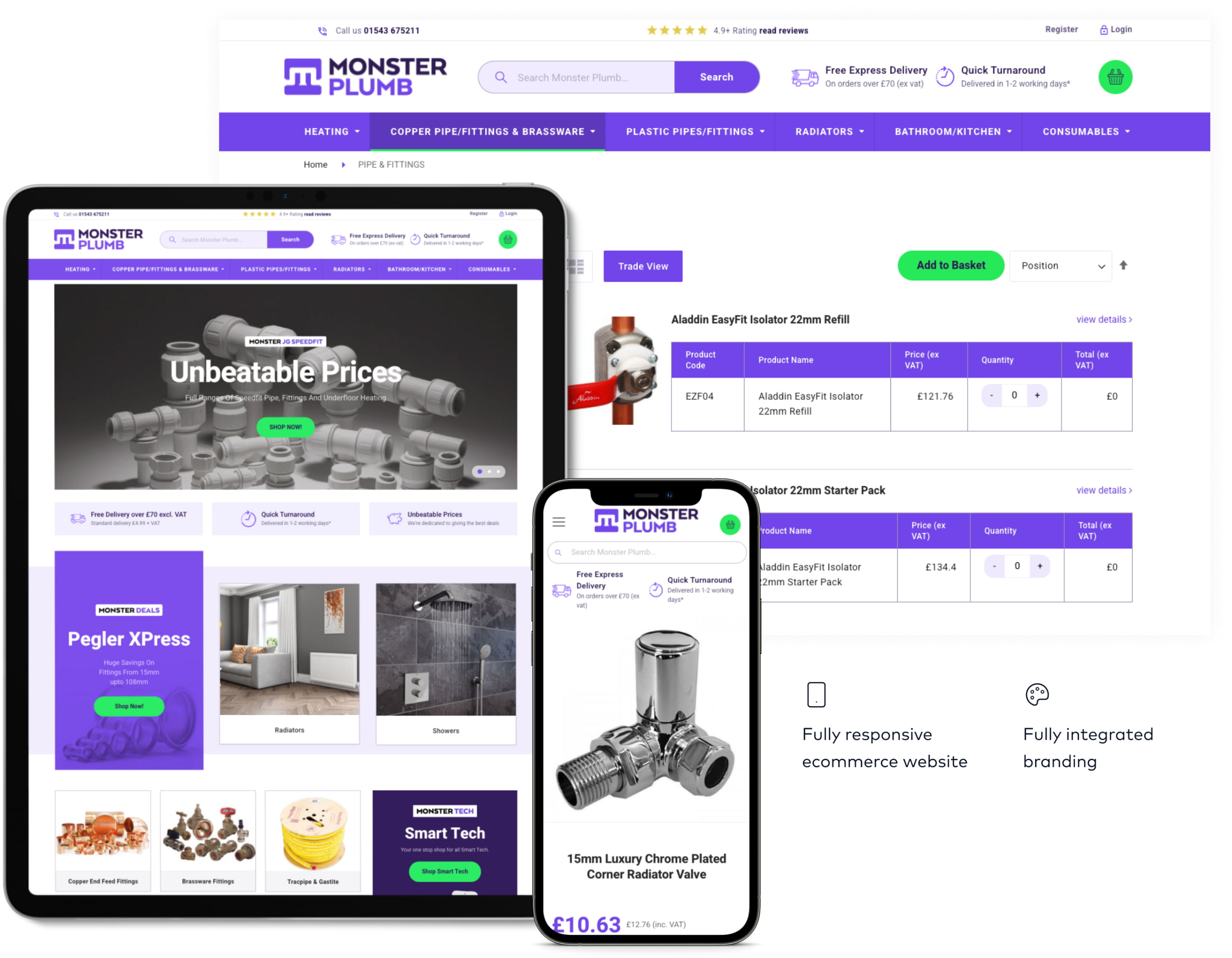
Coming to us and after assessing the website and the needs, we came to the conclusion that for the scale of the business and what needed to be done, the best solution would be to build it in Magento 2.
Custom product category development
Whilst building the website, we came across a key issue with products that have options. By default, when looking through a product category, if a product has options, the only way to see the options is to visit the product page. This would cause a problem as people ordering these products would likely want to purchase man products from the range available, meaning customers would have to go in and out of product pages to get them.
So, there were two standard solutions that are part of default Magento 2
- Only see the product options on the product page.
- List everything as a singular product so they don’t have options.
In both cases, this would lead to it taking longer to go through a category to find the product they want, making it more likely they would become frustrated with trying to find what they want and then leaving the site without making a purchase.
So we came up with a third solution, make the options viewable on the product category page. This required us to do some custom development, but ultimately provided a better result by keeping the product categories more concise and easier to navigate.
Effective product landing pages
The website heavily uses Google’s PPC shopping ads and this is where the majority of the website gets its traffic from. So knowing this, we needed to create an effective product page that would help drive people to buy the products.
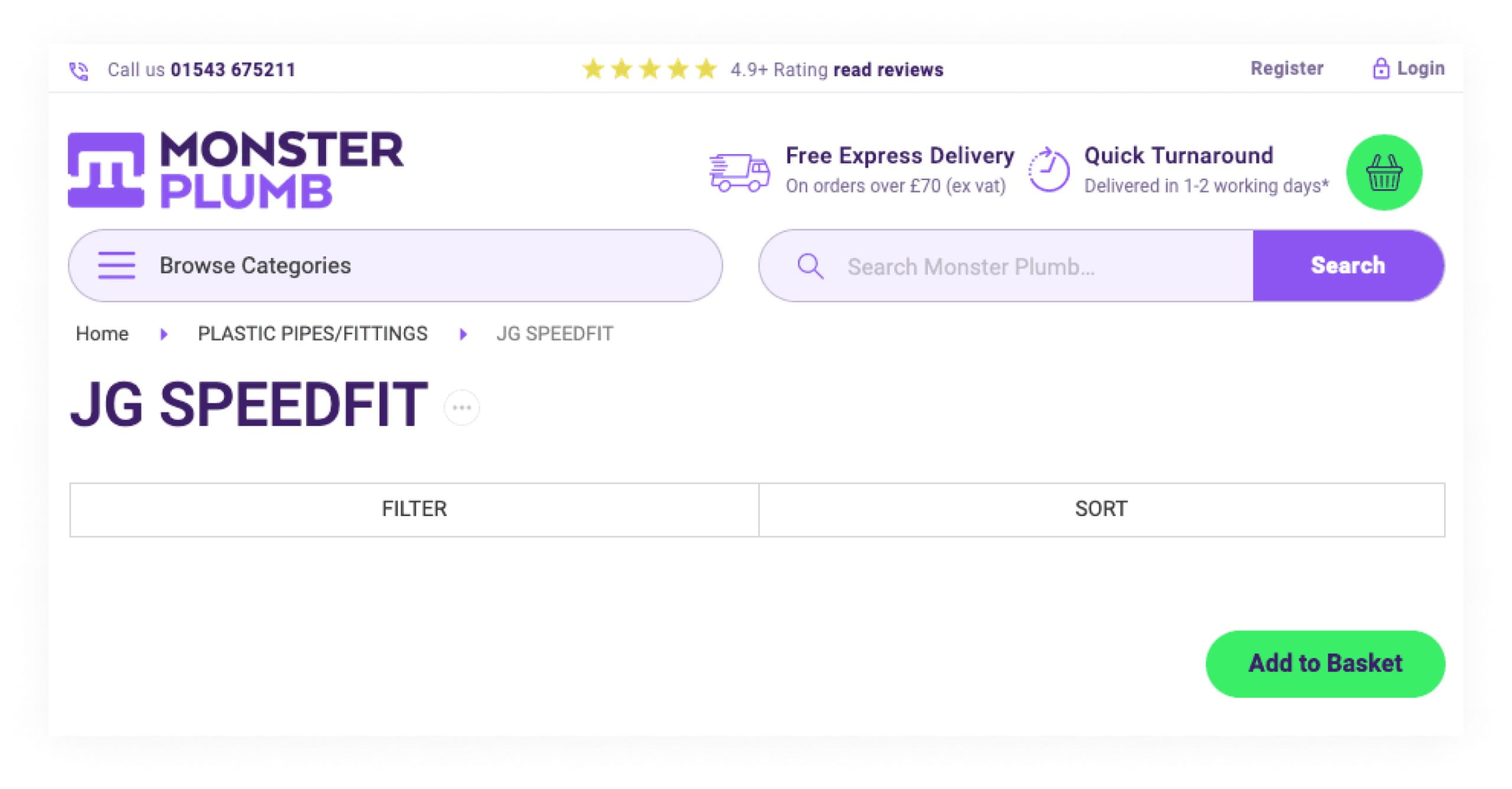
So we started off by ensuring that the most important details were obvious when you first land on the product page. For example, showing elements such as quick turn around on delivery is a key feature and the hurdle based free delivery.
We also added the delivery and returns information to the product pages, as tgis is important to those that buy these products and keeps them engaged on the product page, rather than them needing to navigate back and forth.
34.82%%
Transactions Increased
110.36%%
Unique Purchases Increased
New design success with increased sales
The new website has been a huge success, going live in September 2019. In the 3 months leading up to the end of the year (October – December), it saw increases across the board.
The new website has been a huge success, going live in September 2019. In the 3 months leading up to the end of the year (October – December), it saw increases across the board.
Director Director, Monsterplumb
https://www.isev.co.uk/wp/wp-includes/js/dist/hooks.min.js
https://www.isev.co.uk/wp/wp-includes/js/dist/i18n.min.js
wp.i18n.setLocaleData( { 'text direction\u0004ltr': [ 'ltr' ] } );
https://www.isev.co.uk/app/plugins/contact-form-7/includes/swv/js/index.js
var wpcf7 = {"api":{"root":"https:\/\/www.isev.co.uk\/wp-json\/","namespace":"contact-form-7\/v1"},"cached":"1"};
https://www.isev.co.uk/app/plugins/contact-form-7/includes/js/index.js
window.ASL = typeof window.ASL !== 'undefined' ? window.ASL : {}; window.ASL.wp_rocket_exception = "DOMContentLoaded"; window.ASL.ajaxurl = "https:\/\/www.isev.co.uk\/wp\/wp-admin\/admin-ajax.php"; window.ASL.backend_ajaxurl = "https:\/\/www.isev.co.uk\/wp\/wp-admin\/admin-ajax.php"; window.ASL.js_scope = "jQuery"; window.ASL.asl_url = "https:\/\/www.isev.co.uk\/app\/plugins\/ajax-search-lite\/"; window.ASL.detect_ajax = 1; window.ASL.media_query = 4766; window.ASL.version = 4766; window.ASL.pageHTML = ""; window.ASL.additional_scripts = [{"handle":"wd-asl-ajaxsearchlite","src":"https:\/\/www.isev.co.uk\/app\/plugins\/ajax-search-lite\/js\/min\/plugin\/optimized\/asl-prereq.js","prereq":[]},{"handle":"wd-asl-ajaxsearchlite-core","src":"https:\/\/www.isev.co.uk\/app\/plugins\/ajax-search-lite\/js\/min\/plugin\/optimized\/asl-core.js","prereq":[]},{"handle":"wd-asl-ajaxsearchlite-vertical","src":"https:\/\/www.isev.co.uk\/app\/plugins\/ajax-search-lite\/js\/min\/plugin\/optimized\/asl-results-vertical.js","prereq":["wd-asl-ajaxsearchlite"]},{"handle":"wd-asl-ajaxsearchlite-load","src":"https:\/\/www.isev.co.uk\/app\/plugins\/ajax-search-lite\/js\/min\/plugin\/optimized\/asl-load.js","prereq":["wd-asl-ajaxsearchlite-vertical"]}]; window.ASL.script_async_load = false; window.ASL.init_only_in_viewport = true; window.ASL.font_url = "https:\/\/www.isev.co.uk\/app\/plugins\/ajax-search-lite\/css\/fonts\/icons2.woff2"; window.ASL.css_async = false; window.ASL.highlight = {"enabled":false,"data":[]}; window.ASL.analytics = {"method":0,"tracking_id":"","string":"?ajax_search={asl_term}","event":{"focus":{"active":1,"action":"focus","category":"ASL","label":"Input focus","value":"1"},"search_start":{"active":0,"action":"search_start","category":"ASL","label":"Phrase: {phrase}","value":"1"},"search_end":{"active":1,"action":"search_end","category":"ASL","label":"{phrase} | {results_count}","value":"1"},"magnifier":{"active":1,"action":"magnifier","category":"ASL","label":"Magnifier clicked","value":"1"},"return":{"active":1,"action":"return","category":"ASL","label":"Return button pressed","value":"1"},"facet_change":{"active":0,"action":"facet_change","category":"ASL","label":"{option_label} | {option_value}","value":"1"},"result_click":{"active":1,"action":"result_click","category":"ASL","label":"{result_title} | {result_url}","value":"1"}}};
https://www.isev.co.uk/app/plugins/ajax-search-lite/js/min/plugin/optimized/asl-prereq.js
https://www.isev.co.uk/app/plugins/ajax-search-lite/js/min/plugin/optimized/asl-core.js
https://www.isev.co.uk/app/plugins/ajax-search-lite/js/min/plugin/optimized/asl-results-vertical.js
https://www.isev.co.uk/app/plugins/ajax-search-lite/js/min/plugin/optimized/asl-load.js
https://www.isev.co.uk/app/plugins/ajax-search-lite/js/min/plugin/optimized/asl-wrapper.js
!function(){"use strict";var e,t,r,n={},o={};function i(e){var t=o[e];if(void 0!==t)return t.exports;var r=o[e]={exports:{}};return n[e](r,r.exports,i),r.exports}i.m=n,e=[],i.O=function(t,r,n,o){if(!r){var u=1/0;for(s=0;s<e.length;s++){r=e[s][0],n=e[s][1],o=e[s][2];for(var a=!0,f=0;f<r.length;f++)(!1&o||u>=o)&&Object.keys(i.O).every((function(e){return i.O[e](r[f])}))?r.splice(f--,1):(a=!1,o<u&&(u=o));if(a){e.splice(s--,1);var c=n();void 0!==c&&(t=c)}}return t}o=o||0;for(var s=e.length;s>0&&e[s-1][2]>o;s--)e[s]=e[s-1];e[s]=[r,n,o]},i.d=function(e,t){for(var r in t)i.o(t,r)&&!i.o(e,r)&&Object.defineProperty(e,r,{enumerable:!0,get:t[r]})},i.f={},i.e=function(e){return Promise.all(Object.keys(i.f).reduce((function(t,r){return i.f[r](e,t),t}),[]))},i.u=function(e){return"js/"+e+"."+{203:"945991",331:"6d9a60",434:"cf540c",514:"1cf7a3"}[e]+".js"},i.miniCssF=function(e){},i.o=function(e,t){return Object.prototype.hasOwnProperty.call(e,t)},t={},r="@roots/bud/sage:",i.l=function(e,n,o,u){if(t[e])t[e].push(n);else{var a,f;if(void 0!==o)for(var c=document.getElementsByTagName("script"),s=0;s<c.length;s++){var l=c[s];if(l.getAttribute("src")==e||l.getAttribute("data-webpack")==r+o){a=l;break}}a||(f=!0,(a=document.createElement("script")).charset="utf-8",a.timeout=120,i.nc&&a.setAttribute("nonce",i.nc),a.setAttribute("data-webpack",r+o),a.src=e),t[e]=[n];var d=function(r,n){a.onerror=a.onload=null,clearTimeout(p);var o=t[e];if(delete t[e],a.parentNode&&a.parentNode.removeChild(a),o&&o.forEach((function(e){return e(n)})),r)return r(n)},p=setTimeout(d.bind(null,void 0,{type:"timeout",target:a}),12e4);a.onerror=d.bind(null,a.onerror),a.onload=d.bind(null,a.onload),f&&document.head.appendChild(a)}},i.r=function(e){"undefined"!=typeof Symbol&&Symbol.toStringTag&&Object.defineProperty(e,Symbol.toStringTag,{value:"Module"}),Object.defineProperty(e,"__esModule",{value:!0})},i.p="/app/themes/isev-theme/public/",function(){var e={666:0};i.f.j=function(t,r){var n=i.o(e,t)?e[t]:void 0;if(0!==n)if(n)r.push(n[2]);else if(666!=t){var o=new Promise((function(r,o){n=e[t]=[r,o]}));r.push(n[2]=o);var u=i.p+i.u(t),a=new Error;i.l(u,(function(r){if(i.o(e,t)&&(0!==(n=e[t])&&(e[t]=void 0),n)){var o=r&&("load"===r.type?"missing":r.type),u=r&&r.target&&r.target.src;a.message="Loading chunk "+t+" failed.\n("+o+": "+u+")",a.name="ChunkLoadError",a.type=o,a.request=u,n[1](a)}}),"chunk-"+t,t)}else e[t]=0},i.O.j=function(t){return 0===e[t]};var t=function(t,r){var n,o,u=r[0],a=r[1],f=r[2],c=0;if(u.some((function(t){return 0!==e[t]}))){for(n in a)i.o(a,n)&&(i.m[n]=a[n]);if(f)var s=f(i)}for(t&&t(r);c<u.length;c++)o=u[c],i.o(e,o)&&e[o]&&e[o][0](),e[o]=0;return i.O(s)},r=self.webpackChunk_roots_bud_sage=self.webpackChunk_roots_bud_sage||[];r.forEach(t.bind(null,0)),r.push=t.bind(null,r.push.bind(r))}()}();
https://www.isev.co.uk/app/themes/isev-theme/public/js/app.b5b5ef.js
https://www.isev.co.uk/wp/wp-includes/js/hoverIntent.min.js
https://www.isev.co.uk/app/plugins/megamenu/js/maxmegamenu.js


